Subscription-led acquisition
Project overview
Naked Wines are a direct to consumer online retailer; they traditionally rely on onboarding customers to their Angel membership (a bit like a wine piggy bank). In this project they wanted to explore whether it was possible to onboard customers onto a wine subscription, where customers received personalised wine deliveries on a recurring basis.
When:
March 2023 - December 2023
Platform:
Web
Focus:
Acquisition
Context
I was the product designer in the subscriptions squad. We were a team of 6 including: a Product Manager, a Front End developer, 2 Back End developers and a QA.
Problem
New customers have a high attrition rate and some research was conducted that suggested onboarding customers onto a subscription might reduce this.
Goal
We needed to figure out how to onboard new customers onto a subscription whilst creating a 'best in class' experience that would truly impress customers (music to my ears!) and ultimately reducing initial attrition.
Happy path
Register voucher
Enter base settings for subscription
Chooses a welcome case
Add product to basket
Checkout & Sign up to a subscription
Methods
Comp analysis
Usability testing
User Interviews
System mapping
User journey mapping
Visual design
Content mapping
0-1 product
Markets
Naked Wines operates across 3 markets
Built and tested in USA, their largest channel
To be rolled out in UK and AUS if successful
Figma
🛠️
Userzoom
🛠️
Miro
🛠️
Smartlook
🛠️
Amplitude
🛠️
Figma 🛠️ Userzoom 🛠️ Miro 🛠️ Smartlook 🛠️ Amplitude 🛠️
Discovery & research
Understanding the problem
It’s been done before: I reviewed how other subscription acquisition funnels dealt with capturing subscription settings to see what we could learn from them.
Understanding how it all works: This subscription was a complex beast. Thanks to our Back End developers, I learnt how it handles personalised case selection and how the subscription fulfilment worked.
What does it look like for the user? We needed to balance the user needs with the technical constraints. I ran a user journey map workshop to get everyone up to speed, empathising with users and helping us all identify customer problems.
Understanding the markets: The US has lots of different alcohol laws and delivery setups, so we reached out to the local markets to help uncover how each market differs, and how that may impact the design.
A look at the data: Working with Product Analytics, we summarised what we already knew about existing funnels and identified what was and wasn’t working.
Problem
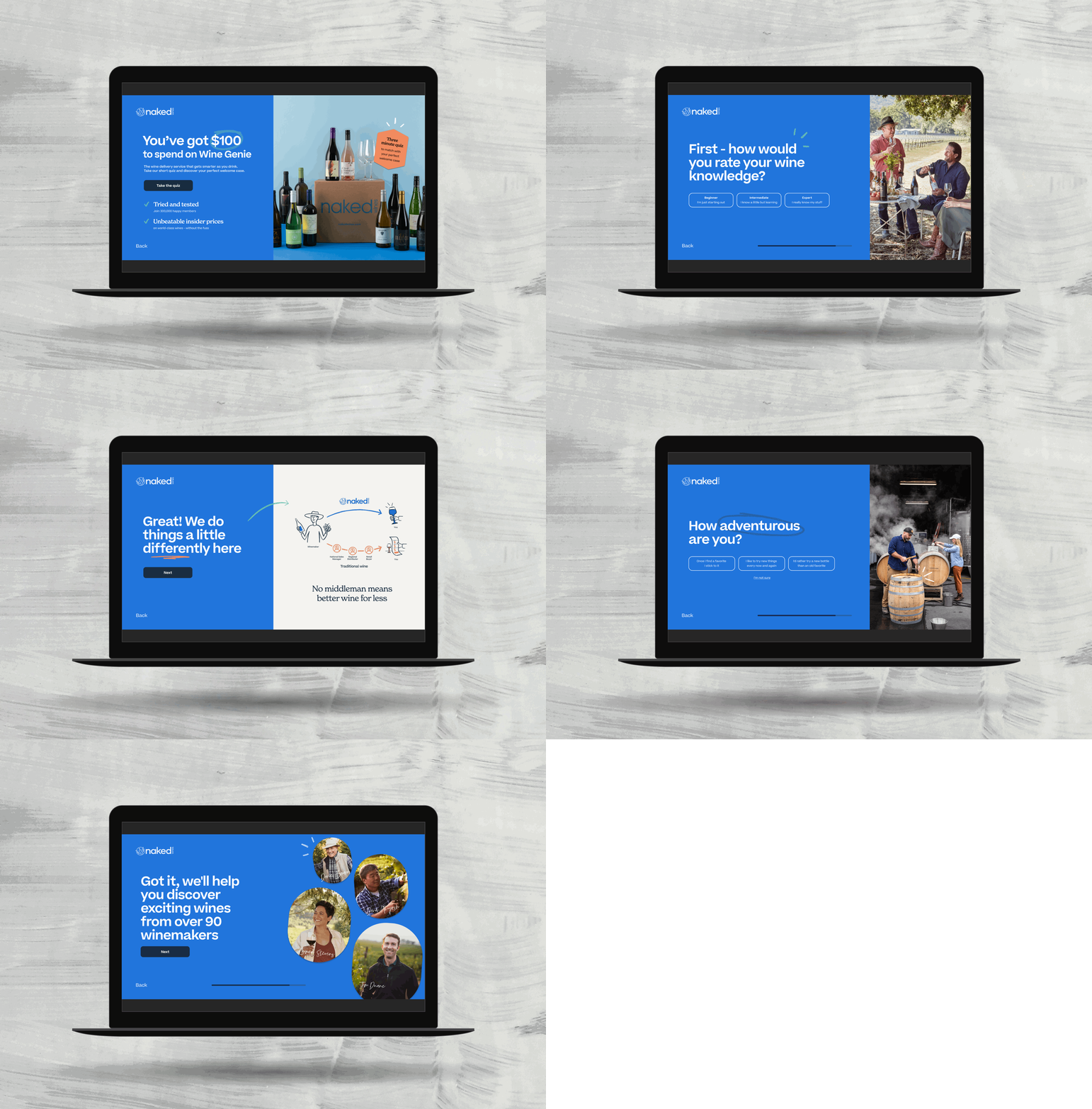
Signing users up for a personalised subscription required capturing the customer’s wine preferences to ensure their second order would be tailored to their tastes. However, we needed to make sure we didn’t distract them from completing their first purchase.
Solution
We gave all new users ‘starter settings’ that they couldn’t edit until after their first purchase was complete. We decided on these settings by identifying the most common preferences amongst our current user base, whilst also reassuring users that they would have a chance to edit their settings before their next order.
Prove interest with an MVP
We needed to prove that we could sign users up to a subscription and that there was interest in it, so we started with a true MVP.
Content map & wireframing: I mapped out what needed to go where, helping us to focus on the messaging before concentrating about what it looked like.
MVP discovery: After presenting early wires back to the squad, we agreed what an MVP would look like from a Front End, Back End and Design perspective.
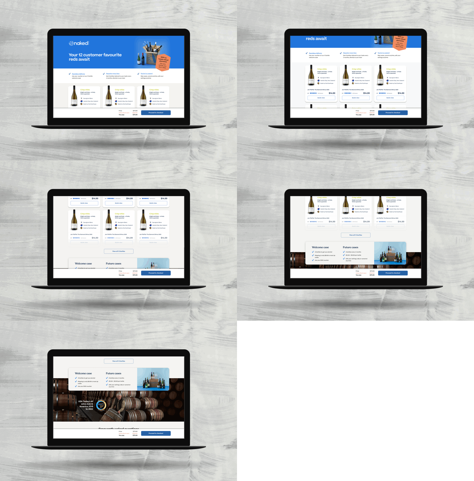
Design: For the MVP, we made some sacrifices from a design perspective, using a dated UI library (see attached image), which allowed us to move quickly and reduce initial build time.
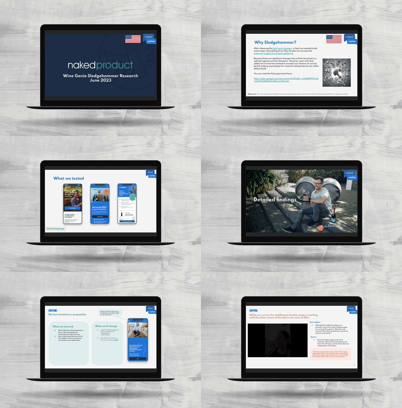
Prototyping: I created a high fidelity prototype for some initial usability testing to make sure our MVP stood the best chance to test if this could work.
Design & development
Optimising our MVP
Smartlook watch party: We reviewed some Smartlook sessions of users navigating the funnel to see if we could spot any obvious struggles.
Review analytics of our MVP: We started to triangulate our qualitative data with our quantitive data from our initial test.
Map out the opportunities: It was important to remove all bias and make sure we were focusing on the high impact, low effort builds first.
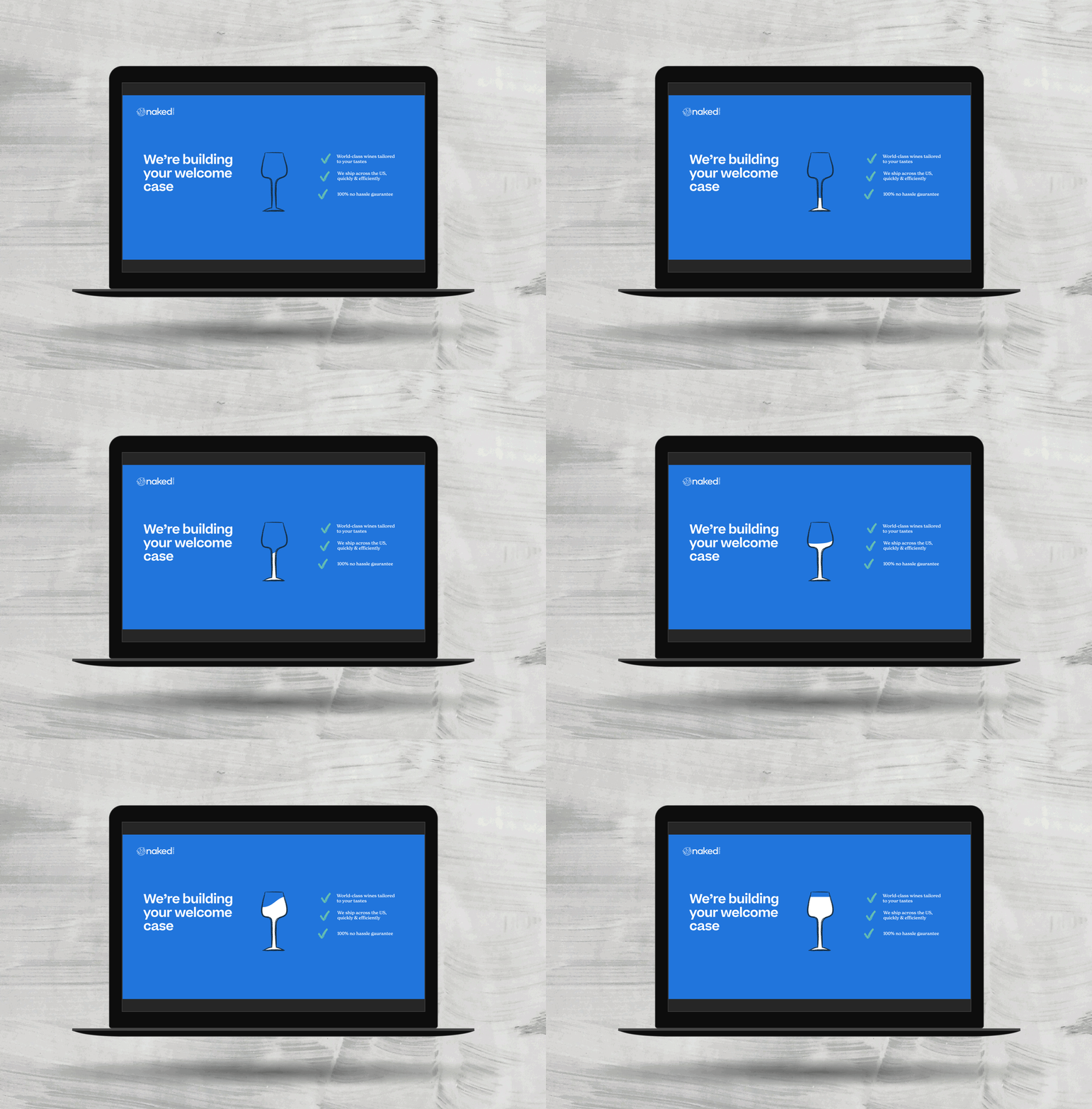
Create a design that delights: This is when I had to build a design we were proud of that wowed customers, for example, the load animation. (see attached).
Content mapping to tell a story: We had a few comments in initial usability testing that indicated that some of our content felt ‘salesy’, so we made sure that the content flowed naturally, spreading information across the whole funnel.
Key improvements
Results
We successfully unlocked subscription lead onboarding
End result
We increased conversion on the MVP by 33%, unlocking subscription onboarding. This flow was shortly be rolled out globally.
Key learning
We realised how much users love a bit of animation; most users from our research mentioned it, creating excitement for the digital experience. Why wouldn’t we want more of this!
If I could turn back time
I would have spent more time on the flow of the quiz in the first iteration. We learnt in the user interviews the importance of showing the users and not telling.


